I recently attended a conference for crafters in Arizona called
Creativation. I had a great time meeting some of the most talented crafters and
vendors. It was interesting for me to be able put an actual face to some names
I’ve been communicating with on social media. Beside meeting friends in the
crafting industry, I had the pleasure of meeting lots of new companies.
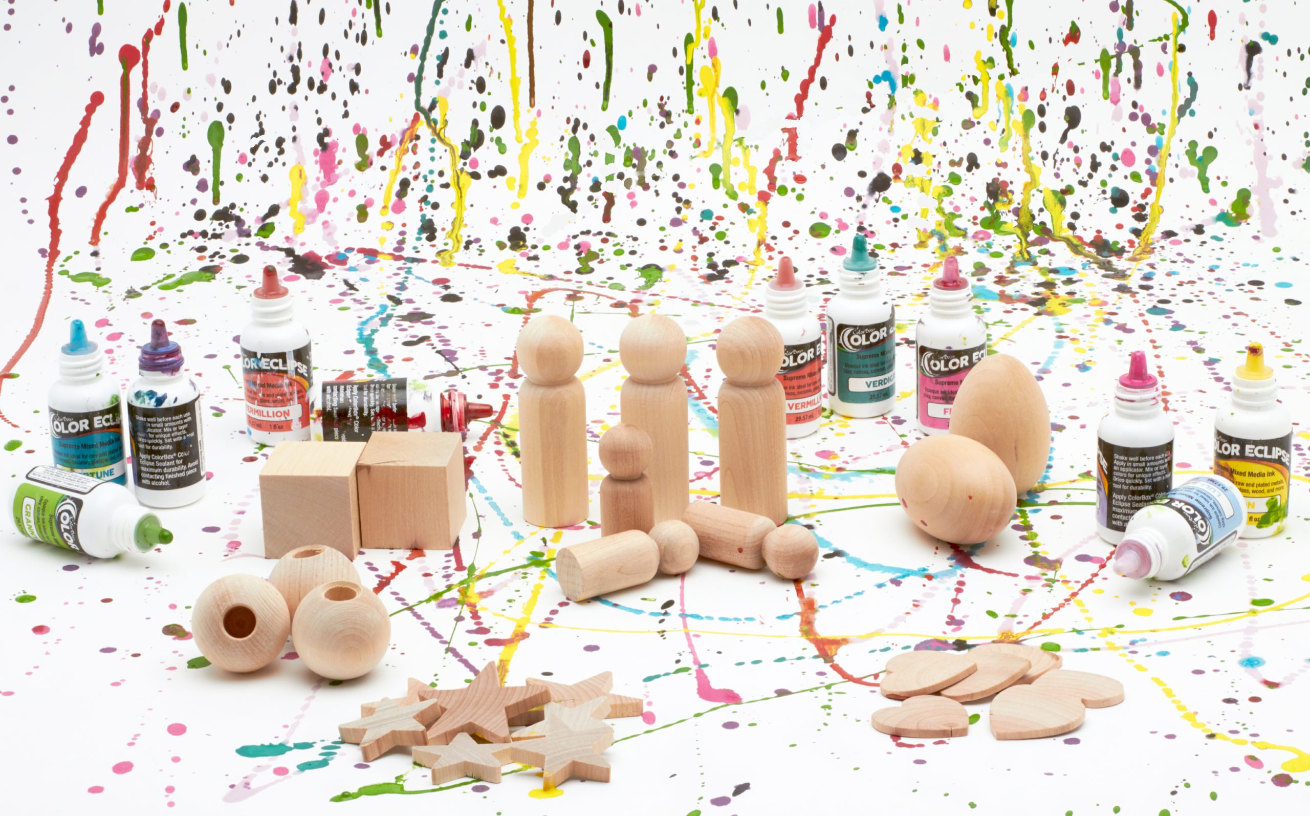
One such vendor, Clear Snap approached me with a product called
Color Eclipse ink dye. They asked if I’d be willing to sample the product for
them. Excited with the prospect of experimenting and rating a product, I
readily agreed to give it a try. At minimum, I’d have a new
product to add to my ever-growing stain selection. I packed away the bottles
and brought them back to our Woodpeckers warehouse where I went stain-happy. Let
me share with you my take on these stains and how they compare to other brands
with similar products.
The product is a relatively new product. It is called Color Eclipse
by the company ColorBox. You can find it on Clear Snaps’ site and it is sold
in a variety of colors. It is an ink made for mixed-media artists and crafters.
The label says it is ideal for raw and plated metals, clay, canvas, ceramic, glass,
wood and more.
Being that I am primarily a wood crafter, I experimented with the
stain on an assortment of wood cutout shapes and loose wooden crafting products. Unfortunately, the stain did not seem
to be perfectly suited for natural wood. I had expected to layer the colors and have them spread. I tried
putting a drop of one color over another but did not obtain the usual alcohol
ink look, because the wood absorbed the ink too quickly. The ink did not have a
chance to spread. The set did not include any sort of spreading medium, which I
felt was necessary. I decided I’d use rubbing alcohol as a blending technique,
based on the fact that it looked like an alcohol ink and the bottle says to
avoid contacting finished piece with alcohol. I figured it most probably reacts
to alcohol. This worked out well and really spread the colors! I was even able
to tilt the piece to get a bit of “flow”.
I wouldn’t use this to try to paint a specific image since it is very
runny and spreads. You can use it to paint an area to achieve more of a tie-dye
effect. Keep in mind that using a solid color over any area will stain
it, as opposed to creating a coated- or painted-look. The dye does dry very
quickly. However, it can always be “revived” by adding a drop of alcohol.
I experimented: some on
natural wood and some on wood that I primed by painting with white paint. I did lots of swiveling and
tilting as with an acrylic pour. Although the raw wood absorbed it too fast,
the alcohol helped with the blending. I also found that if I initially painted
the wood a glossy white, the colors were really vibrant. However, on the
pre-painted surface, you lose the effect of the wood grain. You can set the
color with heat– just don’t blow while the ink is still damp. Unless of course
you are specifically going for the “blowy” look.
The black (obsidian) is very overpowering, so try to go easy on
that! It dries even darker that it looks initially, so it’s not so noticeable
while painting. The white (avalanche) really helps balance everything so you”ll need more of that than the other colors. Although most of the colors were very
beautiful, I would have loved to see a real blue and some tan or brown options!
Be forewarned that this product is addictive! I thought I’d make
one little sample and relay my feedback to the brand. I ended up with a dozen
beautiful pieces while trying out multiple techniques. Once I had it down pat
and knew what I need to do to achieve the looks I like, I just kept on going! Its
lots of fun and comes out completely different every time!